16 December 2011

Another card

This time of year, I'm finding it so hard to fit in crafting time.  But I still managed to make one more Christmas card for C.R.A.F.T. Challenge.  The theme is "Christmas card with removeable item".  I made a double pocket card and added some flavoured teabags, for my husband's aunt: 


Our sponsor this week is Bows and Berries, and I used the adorable Warm Penguin image.  I also used:  Fancy Pants patterned paper, Echo Park patterned paper (for the paper piecing) and Cosmo Cricket Tiny Type alphabet stickers.

To make the card, I followed this tutorial at Splitcoast Stampers.

I'm submitting my card at:
# My Mum's Craft Shop ~ Cute and funky Christmas
# Paper Sundaes ~ Anything Christmas

12 December 2011

A card sketch

This week at C.R.A.F.T. Challenge we have a sketch.  We have two wonderful sponsors and so I've made two different cards.

The first card uses 'Funky Flower' from Floppy Latte Designs:


What I did:
1> I resized the image to create several different sized flowers.
2> I printed the flowers onto patterned paper (Echo Park 'Victoria Gardens')
3> I cut out the flowers, crumpled them, then layered them.
4> I secured the centres - a Basic Grey brad for the big one, and a button for the smaller one.


The next card uses 'Asia' from Glitterbabe:


What I did:
1> I printed one image onto cardstock, and fussy cut around the edges.
2> I printed a second copy of the image onto patterned paper.
3> I cut out the patterned image and paper-pieced the kimono onto the first image.
4> I added some extra colour with gel pens, then assembled the card with embellishments.

I used: Scenic Route paper, Limetree Creations doily, Kaisercraft tiny alphabet stickers, and my own fabric yo-yo flowers.

I'm submitting this card at:
# Crazy Challenge ~ Anything goes

03 December 2011

Guest designing

I'm guest designing over at ARTastic this month, and I'm also providing a RAK prize for one of the winners.

The December challenge is inspired by Thomas Kincade's painting 'A Blessing of Christmas'. The other criteria are: include a snowman, include a Christmas tree, include 'Christmas' in the title.

I have to say, I did find this quite challenging on a number of levels. First, I have hardly any Christmas photographs remaining unscrapped. Next, we don't have snow at Christmas in Australia, so combining the criteria was a little tricky!


Click to enlarge

I took inspiration from the soft lighting in the painting, which gives a kind of ethereal 'blurry' effect. I chose a blurry Christmas photograph from last year, and some dark papers. No snowmen for me, but I thought that the white spotty patterned paper did give a kind of 'snowy' effect... maybe? And the Christmas trees - I made them myself from some offcuts and added a little machine stitching and pearls:


I used papers from 7 Gypsies and Bo Bunny 'Mamarazzi', Lily Bee Designs alpha stickers, lace, Kaisercraft pearls, and some upcycled product tags from a recent shopping trip.

01 December 2011

Something different

This week at C.R.A.F.T. Challenge our theme is 'Christmas Present' - perfect timing for sharing our Christmas gift crafting projects!  One of things I love about the C.R.A.F.T. Challenge blog is that any project is okay - it can be a card, layout, or any kind of hand crafted item.  We encourage young crafters to join in too - everyone is welcome.

I made something a bit different - it's a beaded bookmark:


Not so easy to photograph - in real life it looks pretty cool :)  This is how it's used:


The pictured book is How to Guzzle Your Garden - a non-fiction children's book by Australian author Jackie French.

24 November 2011

Unusual Christmas

The theme this week at C.R.A.F.T. Challenge is a little unusual ~ "Unusual Christmas". I'm sure it can be interpretted in lots of different ways. I made a Christmas card using non-traditional colours (orange and yellow, with a touch of pink) and I also used a non-Christmas image. The image is Umbrella - Closed from our sponsor, The Stamping Boutique. I cut off the handles and turned the image into a Christmas tree, then resized and used two images. Hopefully that's unusual enough to fit the challenge!


I also used: Crate Paper (Emma's Shoppe), Bella gems, Glitz Design alpha stickers

I'm submitting my card at:
# The Stamping Boutique ~ Holiday
# Creative Craft ~ Free for all
# Craft Your Days Away ~ Embellishment bingo ~ gems, ribbon, buttons

17 November 2011

Seeing stars

Thursdays seem to be coming around SO fast... where has this year gone?  This week the theme at C.R.A.F.T. Challenge is 'Stars in your eyes' - and we'd love to see projects featuring stars.  I was lucky to receive a fun image from our sponsor Bugaboo Digi Stamps, and I made this card:


I used: Echo Park 'Victoria Gardens' papers... and that's it!! I  made the stars with auto-shapes in MS Word.  With the busy papers, no other embellishment was needed, though I couldn't resist a touch of K-style doodling around the edges.

I'm submitting my card at:
# Challenge Up Your Life ~ Friendship
# Paper Sundaes ~ Digital images

Jasmine's got stars in her eyes too

Jasmine has participated in another week at C.R.A.F.T. Challenge. I'm so proud of her!  She's taking her Junior DT role very seriously and has been trying so hard to stay ahead with her homework to allow for some dedicated craft time each week. The theme this week is 'Stars in Your Eyes', and she made a thank you card for her teacher:


The image is from the challenge sponsor, Bugaboo Digi Stamps, and Jasmine coloured the shirt to match her own school uniform colours.  She also used Bazzill cardstock, stars from her sticker collection, and twine.


It's also exciting for Jasmine to have her card featured over at the Bugaboo blog this week.

Jasmine is submitting her card at:
# Crafty Cardmakers ~ Recycle (recycled book page)
# Fussy & Fancy ~ Be Thankful (handwritten sentiment)

11 November 2011

Fabulous fabric!


How gorgeous is this 'Garden Patchwork' fabric?? I love the vibrant colours and of course, a bit of red in my life always makes me smile :)   I've started sewing some Christmas gifts already (shhhhh!) and I can picture a super cute skirt for Jasmine using this fabric - and maybe with a matching carrybag too. 

Fabric Traders are giving away some fabric grab-bags (Australia only) - CLICK HERE for details.

10 November 2011

Cuteness

This week is all about the 'cute factor' at C.R.A.F.T. Challenge.    Here's my card, using the adorable Penguin Fun image from one of our weekly sponsors, 2Cute Rubber Stamps (this one is a digi stamp):


I used:  American Crafts 'Pearl' cardstock, Spellbinders Nestabilities 'Labels Sixteen' die, Adorn It tiny alphabet stickers

I'm also submitting at:
# Charisma Cardz ~ Cutesy projects
# Allsorts ~ Anything but square
# One Stop Craft ~ Three is a magic number - Three scoops of icecream, three pieces of trim

Cuteness - Part 2, Jasmine's turn

Jasmine got creative this week for C.R.A.F.T. Challenge - who can resist a "CUTE" theme?? 


Jazi used: 
Cupcake Kitty from 2Cute (digi), Bazzill cardstock, Kaisercraft patterned paper, and a sentiment stamp (possibly Grant Studios)

She's also submitting at:
# Charisma Cardz ~ Cutesy projects

08 November 2011

Scrapping Everyday Miracles

In September I entered a challenge at Scrapping Everyday Miracles, and I was thrilled that my layout was selected as one of the top three.


I was honoured to be invited to be a Guest Designer this month. The theme is 'Nature' and you can read all about the scrap twist HERE, as well as see the lovely contributions of the design team.  This is my layout:


The layout title Jacksonia is the name of this beautiful tree - it is an Australian native species that grows in the wild on my property.

I used paper from Echo Park 'Victoria Gardens', Glitz Designs alphabet stickers, Lime Tree Creations crocheted trim, and a re-purposed waffle-weave tea towel to make my own lollipop flowers and background accent.

I'm also submitting my layout at Lime Tree Creations November challenge - Becci would love to see some of her product used on a creation, and this month the criteria requires using another handmade item.

03 November 2011

A bookmark

Jasmine is joining in at C.R.A.F.T. Challenge again this week. The theme is 'Family Activities' and she chose sewing because it is something that the two of us do together. I have been teaching her to sew and she has her own little sewing machine too.

Here is her bookmark:


The image is 'Pin Cushion' from Bows and Berries, our lovely sponsor this week.  The ribbon is from Maya Road, and Jasmine made the buttons herself from Bazzill cardstock.


Jazi is also playing along at:
# Paper Sundaes ~ Bookmarks
# Dream Valley ~ Anything goes
# One Stop Craft ~ No sentiments 
# Bows and Berries ~ Clean and simple

Some sketchy goodness...

It's my turn to host the sketch challenge at Scrap Pile this month, and I also broke open a new package of Echo Park papers to create my layout with.

This is the sketch:


Digital credits:  'Grunge' papers by Toucan Scraps; 'A Delightful Day' journalling card (kit possibly retired) by Chelsea Parsons 

And this is my layout:


The layout is also my contribution to C.R.A.F.T. Challenge this week - with a theme of Family Activities.  Thank you Robin at Bows and Berries, who generously provided the 'Sewing Machine' image for me to use:


I used: Echo Park 'Victoria Gardens' papers and stickers, American Crafts foam Thickers, Prima 'Gatsby' flower (Myrtle) and packaging, and baker's twine. I'm probably the last scrapper in the universe to use baker's twine - I'm a bit slow on the uptake when it comes to trends!

I'm also submitting my layout at:
# Dream Valley ~ Anything goes
# Paper Playtime ~ Anything goes

30 October 2011

Folding card

I have a fun card to share - this one is a little more intricate than my usual ones. I followed this tutorial and created this:


I used papers from Kaisercraft and Bo Bunny, and a few leftovers from Cosmo Cricket and MME.  The flower, ribbon and button have been floating around on my desk for months, and it was time to use them!

Today I'm playing along at:
# Our Creative Corner ~ Fancy folds
# Charisma Cardz ~ Anything goes
# One Stop Craft ~ No sentiments

27 October 2011

Jasmine's card

Jasmine is a Junior DT at C.R.A.F.T. Challenge, and will try to create something every week, if she has finished all her homework!  This week she's on track, and made a lovely card for the colour challenge:


She used: 7Gypsies and Carolee's Creations patterned papers, Spellbinders 'Labels Four' dies, Tim Holtz 'Tattered Florals' dies, sentiment stamps (unknown company), StazOn 'Timber Brown' ink

Autumn colours...

The theme this week at C.R.A.F.T. Challenge is autumn colours - and this is the palette we are working from:


My submission is a little different this time - it's a knitted scarf that I made for my friend's birthday:


I tried some 'bobbly' fibre for the first time - and while I loved the finished effect, it wasn't all that easy to knit with, and it took me waaaaay longer than I expected!  And I must admit I loved it so much that it was very hard to part with!!

26 October 2011

Celebrating "Odd" style!

My Dollie-friend Kristy is celebrating her birthday this month - HAPPY BIRTHDAY KRISTY!!   Pop across to her blog for some amazing tutorials, product showcases and other fun stuff - the girl really knows how to host a party!


My most recent card using a Some Odd Girl image is here, and you can find the full collection of amazing Some Odd Girl images in the store HERE.

24 October 2011

A little bit grungy

I've been enjoying the Passion for Fashion challenges at Scrap Boutique over the past few weeks, and loving the chance to push myself a bit.   This week it's all about grunge - a style I love but don't actually indulge in very often:

GRUNGE - A category which was made popular during the early 90's. It creates an emphasis of younger generations, exaggerated constructions, the ripped, unloved look was popular.

Colour - Could be anything. Camoflage was popular.
Lines - Unstructured, sometimes exaggerated and unusual.
Textures - Popular (natural, blend or synthetic fibers), knits or canvas, frayed hems.
Effects - Youthful, confident but sometimes impractical. Most designs died quickly.
Needs - Easy pieces, but sometimes wild and usually inexpensive.
Favourite accessory - All kinds, real or fakes, inexpensive accessories including disposables.
Note: Notice the exaggerated lines, sometimes out-of-this-world. Different styles were popularized by Madonna and Cindy Lauper in the 80's. Very artistic and sometimes unexplainable designs.


Click to enlarge

I had fun with the paper-tearing, paint and stapling.  My layout focuses on thecriteria of unstructured lines and inexpensive accessories, and the overall effect of youth, confidence, and sometimes wild.  The photographs were taken at the 21st Century Kids program at GOMA in Brisbane - there was a giant twin slippery slide inside the gallery foyer!

21 October 2011

I wrote a letter to my love...

This week at C.R.A.F.T. Challenge the theme is Autumn.  I made a card using autumn colours:


Our sponsor this week is Some Odd Girl - and I chose to showcase the adorable "Love Letter Kaylee" from the store. I also used: CTMH cardstock and paper, Echo Park 'For the Record' paper, and Cosmo Cricket alpha stickers. And I couldn't resist a little doodling too :)

The Odd Girl herself is celebrating her birthday this month - HAPPY BIRTHDAY KRISTY!!  Pop across to her blog for some amazing tutorials, product showcases and other fun stuff.


I'm submitting my card at:
# Simon Says ~ Nursery rhyme (A-tisket, A-tasket)

18 October 2011

Elegant?

I don't really consider myself an "elegant" scrapper so last week's Passion for Fashion challenge at Scrap Boutique stretched me a bit.  The layout was based on a provided sketch, and was inspired by the criteria:

ELEGANT This style includes expensive designer's reproduction, but should not be misunderstood as "haute" or high fashion.
Colour ~ Unusual, muted solid colors (gray, black and white)
Lines ~ Mostly uncomplicated and well fitted (Chanel type)

Textures ~ Fabrics, usually expensive materials.
Effects ~ Very refined, status and executive-looking.
NeedsSemi custom-made or altered to fit.
Favorite Accessory ~ Coordinated and matching real gold and diamond accessories.
Note:
Notice the emphasis on the uncomplicated, well fitted status look.


I made the flowers myself :)

13 October 2011

Shaping up

This week at C.R.A.F.T. there's another recipe challenge.  Usually I struggle with these ones, but this week I really enjoyed myself and found it came together quickly:


The recipe is:
* 1 ribbon - I used some wrinkled ribbon from Prairie Bird Boutique
* 2 shapes - two shaped journalling pages (Making Memories)
* some glitter - glitter alphabet letters (American Crafts "Bliss" Thickers)

I also used: Lily Bee 'Picket Fence' paper, Prima flowers and Bella rhinestones.

It's a fairly basic layout, but I wanted to keep it simple to keep the focus on the photograph.

I'm entering my layout at:
# Papertake Weekly ~ Get in Shape
# Dream Valley ~ Monochrome

09 October 2011

The J-girl scraps!

It's been a while since she sat down and focussed on something - but today she found an old photograph of Ella (our guinea pig) and decided to do a layout.

This is her page - I think it's fabulous!


She raided my older stuff and used:  Dream Street paper, striped ribbon (unk), buttons from my habby stash, fabric flowers.  She made the title herself by cutting out WordArt letters and colouring with a watercolour pencil.


Jazi is entering her page at:
# Glitter Geeks ~ Flower power
# Papertake Weekly ~ Anything Goes 
# My Mum's Craft Shop ~ All Creatures Great and Small

08 October 2011

Going Casual

Another layout this week, inspired by the Passion for Fashion criteria at Scrap Boutique...

CASUAL - This category includes jeans, Tshirts, feeling at-home, feeling comfortable.
Colour - Any!! Colour is not an issue (brights, pastels, earth tones)
Lines - Unstructured, simple, and easy.
Textures - Popular (natural, blend or synthetic fibers).
Effects - Easy-going, athletic, unpretentious and simple.
Needs - Easy care, home atmosphere and comfortable.
Favorite Accessory - Flip Flops, joggers, basic accessories, including disposables.
Note: Notice the easy-going features and UNSTRUCTURED lines.

Here's my layout - I made a double 8"x8":


Click to enlarge

I used: Basic Grey 'Urban Couture - Cashmere' paper, American Crafts vinyl Thickers, Heidi Swapp journalling spots 'Ledger2'. All the rest is non-commercial stuff - denim from some old jeans, muslin gauze cut from a triangular bandage, buttons, and a broken hairclip:


I'm entering my layout at:
# Hooked on Craft ~ Anything but a card

06 October 2011

Is it...

too bright? This week at C.R.A.F.T. the theme is 'bright colours', and this is my contribution:


It was a little tricky to photograph because the shiny cardstock kept reflecting back at me no matter what I tried!  I used the brightest paper in my stash - one of my last remaining scraps of Cosmo Cricket 'DeLovely', and the brightest ribbon (May Arts).  The white cardstock is inked with Versacube 'Pink Petal'.  The adorable image is 'Little Art Mouse' from our sponsor, Meljen's Designs.

I'm entering my card at:
# Craft Your Passion ~ Anything goes (with ribbon)
# Simon Says ~ Sparkle - I used American Crafts pearl cardstock

02 October 2011

A little bit Western

Another week of the Scrap Boutique Passion for Fashion challenge, and this time the theme is WESTERN.  The criteria states:
The opposite of conservative. Clothes are reduced from the feminine emphasis.
Colour - Earth tones are favourites.
Lines - Durable, simple, easy and comfortable.
Textures - Natural fibres, basic denim, thick and old-fashioned.
Effects - Tough, strong, manly.
Favourite Accessory - Big is better, cowboy leather boots and thick belt buckles.
Note: Notice the emphasis of earth tone colors

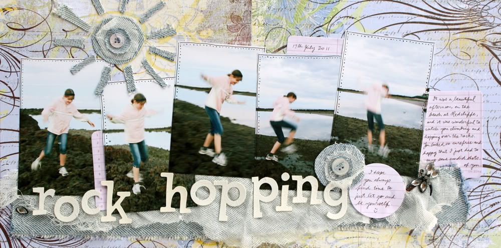
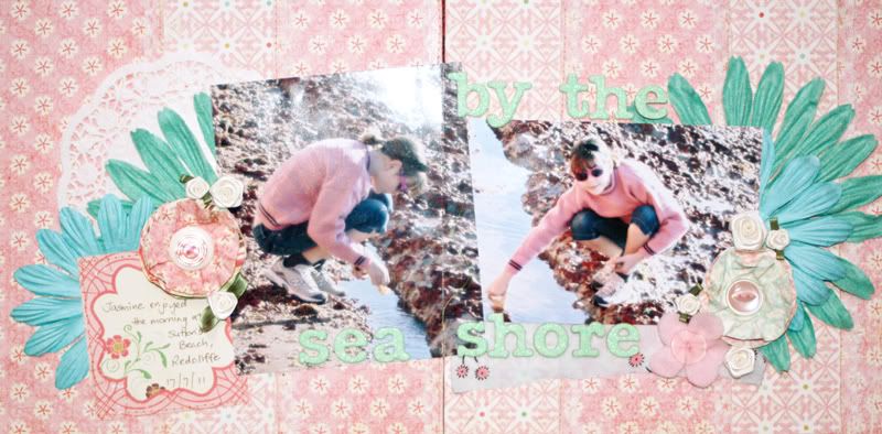
This is my interpretation:


Click to enlarge


I had heaps of fun with this layout - I painted a piece of corrugated cardboard (Kaiserpaint 'lime green') and cut a piece from some old jeans. for the background. I keep a box in the shed with fabric oddments, including several pairs of old jeans (which I kept for patching our current jeans, LOL!). I had to rummage to find it... The denim is held in place with strategically placed staples, hidden under the flowers (Petaloo) and other elements. The buckle has been in my stash for at least 5 years - I hardly ever use metal embies these days and I had to rummage to find my box of metal bits too ;) I painted and inked it to take away the original shiny copper colour. 

What else? Alphas are from October Afternoon and journalling spot is from Jillibean Soup. The little label sticker is from a small sheet I was given; my best guess is Scenic Route, but I'm not sure??  The mesh and jute flower were both RAK's from kind friends - I know the flower was from Melissa, but the mesh - no idea!!

30 September 2011

Some more girliness...

After finishing this layout, I was in a girly kind of mood, and keen to make another pink one.   I was inspired by the colours in this gorgeous picture from Cupcake Inspirations:


This one is a double using some delicious Echo Park 'Life is Good' papers:


Click to enlarge

I made two paper flowers (box folded) and one felt flower with pinched petals and a button in the middle:


I also used:  Green Tara 7cm flower, (no idea what brand the big one is!) American Crafts 'Dear Lizzy' Glitter Thickers "Bliss".

I'm entering my layout at:
# Berry7Bleu ~ Pink and mint + three handmade flowers
# Kaboodle Doodles ~ Pretty Doily
# Paper Sundaes ~ Anything Goes

29 September 2011

Celebrating 49...

I didn't get any really nice photographs this year for P's birthday - actually, only one shot turned out. As a scrapper, I must admit I'm guilty of procrastination when it comes to photographs I'm not happy with - silly, I know. 

It should be all about capturing the memories, not showcasing a perfect photograph. So, I got motivated this week to print out a few 'not so perfect' photographs and I started scrapping. 

I started with this inspiration photo at C.R.A.F.T. Challenge this week:


Focussing on the orange balloons, I went with a birthday theme, and scrapped this layout:


Almost everything I used is from We R Memory Keepers 'Fiesta' collection - kindly given to me by my friend Melissa. Mel - it took me a while, but I finally used some of those papers!! The only extras are the foam Thickers from American Crafts, and the May Arts red gingham ribbon.

I'm submitting my layout at:
# Celebrate the Occasion ~ Use ribbon
# Deep Ocean ~ Happy birthday

28 September 2011

Another Lily Bee layout

I've been using more Lily Bee - I *love* these papers! My Craft Spot wants to see ribbon, and I based my on a sketch at Pixie Dust Paperie:


Edited 29/9: My friend Roxy suggested I enter my layout at Seriously Creative Challenges this month - where the criteria is: 1 ribbon (May Arts gingham); at least 2 embellishments (Prima flowers, buttons, pin, Jillibean Soup journalling card); 3 patterned papers (Lily Bee 'Picket Fence' x2, Making Memories 'Noteworthy' page x1).

25 September 2011

A little conservative...

This week's brief at Scrap Boutique "Passion for Fashion" was CONSERVATIVE (feminine/demure).

Colours - Pastel, soft blends, muted rainbows.
Lines - Simple flows, rounded curves and semi- fitted.
Textures - Light, flowing, lace,usually old-fashioned small print.
Effects - Fragile, soft, charming, innocent and very feminine.
Favourite Accessory - Very simple accessories, sometimes diamond accessories.
Note: Notice the simple accessories, its pastel colours and rounded lines.

This is how I interpretted the criteria:


Click to enlarge

My favourite bits are the yo-yo flowers, which I made myself, and the organza ribbons:


I'm also submitting my layout at:
# Crafty Ribbons ~ Anything Goes ~ I used pale pink satin-edged organza ribbons

18 September 2011

A Passion for Fashion - Week 2

Week 2 of the Scrap Boutique 'Passion for Fashion' challenge, was all about being dramatic...

My layout:


How I interpretted the criteria:

DRAMATIC(Theatrical)  This style creates a glamorous and glitzy impact.
Colour: Strong, vivid, and contrasting (black is a favourite).
I chose a black background (Core'dinations 'Nightfall') and contrasted with red.
Lines: Severe, sharp and unusually asymmetrical. Bold and often overwhelmingly fitted with open slits.
I think the second statement describes Betty's usual attire!  But I grabbed onto the idea of sharp lines, and I created an asymmetrical stitched border with both straight and zigzag stitches. 
Textures: Rare and trendy.
I tried to mix up the textures a bit.
Effects: Confident, chic, sexy and catchy.
Betty Boop's persona captures the first three, and her theme song and signature phrase are catchy :)
Needs: Custom-made or altered to fit.
I made a silver 'spotlight' and I added a line of brads to the black matt to mimic the look of a film strip.
Favourite Accessory: Bold statement, usually metallic.
I chose silver for the accessories, and also a glittery title (American Crafts Thickers).  
Note:  Notice the fit, its impact and its open slits. Sometimes open back design or see-through materials are used.
I used lace for the see-though element

Other products:  Cosmo Cricket 'Circa 1934' papers - I chose these to match the era of Betty Boop :)  The flowers are Bella (red) and Petaloo (black). The little journalling pin is from my2angels, and was a RAK from my friend Melissa.  Thank you xx